What can we do with ExtJS GridPanel?
I have to develop a lot of applications in my web app and I see that grid component of ExtJS may fit in. However, I am not aware of what all things I can do with the
- off the shelf available framework pieces
- available plug-ins in the marketplace and
- custom development through my own developers
This is a typical question that we hear from the business users who wants to design an application by keeping the framework’s capability in perspective. In this article I have tried to put the list of stuff you can do with grid and hopefully that shall enable you to take advantage of the beauty of ExtJS.
- available plug-ins in the marketplace and
- custom development through my own developers
Pre-requisites
This article assumes that you are familiar with basics of ExtJS
What are the available options?
In this section I will be taking you through some of the commonly seen usage of ExtJS grid panel. While covering all the capabilities of grid may not be possible, I am sure it will be helpful for the business users who want to understand what he / she can do with this component of ExtJS. This article needs continuous improvement to make this further useful. I am looking forward to feedback and suggestion to make this article even more useful.
Data in a tabular format
Showing the tabular data in a tabular form is the first thing you can do using a grid panel.

In case you don’t want to have header and panel title then you may like to do following
// title : 'Simpsons',  // Don't specify the title configuration and
hideHeaders : true,  // To hide the headers
border : false,  // To remove a border. The value defaults to true and it allows you to mention numeric value to specify the desired border.
This will give you the table in its simplest form:


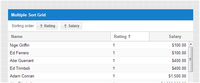
Hideable, Sortable and Reorderable Columns
By default you can sort a grid on any column in ascending or descending order. Also, using Columns menu, you can hide and show the hideable columns. Further, by holding your mouse over an element and dragging it towards other header, you can reorder the columns. And, this is what you get by default.


If you don’t want default behaviour then you can write following code in the column header and get rid of the reorder, sorting, and hideability of a given column:
hideable : false,
sortable : false,
draggable : false
For example when you apply above config on the Phone field then you get following view (sorting disabled, field unhideable and dragging of the Phone column is disallowed) when you click on Phone header’s trigger:

Also, in case you do have a need for sorting on multiple columns then you can make use of the top / bottom toolbar and provide custom sorting buttons as shown in below example (http://docs.sencha.com/extjs/4.2.0/#!/example/build/KitchenSink/ext-theme-neptune/#sliding-pager) from ExtJS doc
Locking / Unlocking of a column
By default a grid and its columns are not lockable or locked. However, using following configurations of the grid, you can have a all the columns lockable to provide lock / unlock capability:
enableLocking : true,

In case you don’t want a given column to participate in locking / unlocking then you can override this for that specific column by setting the lockable configuration to false. Also, if you want a given column of the grid to be always locked in a fixed position (for example you want the first column (Phone Number) to be always fixed) then you can write following code to achieve so:
locked : true,      // Lock the column
lockable : false  // Remove unlocking capability
In above screenshot, for the Phone field, even hideable and sortable are set to false and that means that user won’t get the column trigger either.
Grouping and Summary in a grid
By including following configuration in the store, you can introduce grouping functionality inside your grid component:
groupField: 'city',

You can further make use of grouping feature properties to control the grouping representation. For example below code will allow you to define a template for the group header, hide the grouping column and start thr grouped items in collapsed state.
groupHeaderTpl: '{columnName}: {name} ({rows.length} Item{[values.rows.length > 1 ? "s" : ""]})',
hideGroupedHeader: true,
startCollapsed: true,
With above code change in place, you get a formatted group name as shown below:

Now, if you have a need to show grouping, however, you don’t want to allow collapsing (i.e. standard grid with groups) then you may like to include following configuration inside your grouping feature:
collapsible : false
Make sure that you don’t start in collapse mode. Otherwise, you won’t be able to expand either .
Further if you have a need to style the group names then you can use the array style (or XTemplate class instance) and use styled HTML elements. For example following groupHeaderTpl configuration allows you to have a group with coloured background:
groupHeaderTpl: [
 '
',
 '{columnName}: {name:this.formatName} ({rows.length} Item{[values.rows.length > 1 ? "s" : ""]})',
 '
',
 {
  formatName: function(name) {
   return Ext.String.trim(name);
  }
 }
],

The grouping summary can be achieved by specifying the appropriate summary type (sum, average, count, min and max) in the header definition of the grid. Below screen shows the usage of average for salary and sum for bonus. In addition to summary type, you also need to instruct the grouping feature to show the row summary by using following configuration:
showSummaryRow : true
Finally, if you want to group headers itself then that is also possible by appropriately nesting the column definitions. For example by nesting salary and bonus inside Remuneration, you can provide a grouping of the headers.

Notice that the bonus and salary columns of the grid have been nested inside Renumeration column. After doing this you will be able to see a header as shown in below image:

Pagination toolbar in a grid
By adding a paging toolbar in the bottom (often) or top of the grid, you can add pagination capability for your grid. Of course there will be a need to manage pagination of data using pageSize and totalProperty. Following code allows you to have a paging bar with additional buttons and a quick display message being shown towards the extreme right:
bbar: Ext.create('Ext.PagingToolbar', {
        store: Ext.data.StoreManager.lookup('simpsonsStore'),
        displayInfo: true,
        displayMsg: 'Showng {0} - {1} of {2} contacts',
        emptyMsg: "Nothing to show",
      items :[
        '->',{
          icon : 'https://cdn1.iconfinder.com/data/icons/hallowen_linux/16/Black_Cat.png'
        },
        '-',
         {
                text: 'Additional Buttons'
            }
        ]
    }),
There are plugins like ‘Ext.ux.ProgressBarPager’, which you can make use of to get a paging toolbar similar to the one shown below:

Similarly, you can make use of ‘Ext.ux.SlidingPager’ plugin to have a paging toolbar with slider as shown in below image:

In addition if you have a need for additional toolbar (for example live search) then you can add that too. It will look as shown below:


And, when you don’t care about page numbers and you just want to scroll down fast to get to the relevant data section within the huge set of records, then ExtJS comes up with infinite grid, which enables infinite scrolling; well not literally, but practically yes. Based on the scroll position either it shows the data immediately (depending on the number of rows in buffer) or loads the data for the appropriate range and shows the relevant data to the user. Following screenshot from the ExtJS example shows a sample infinite scrolling grid with free text search filter applied on it:


Refer to below example by Sencha for hands-on experience:
http://docs.sencha.com/extjs/4.2.0/#!/example/grid/infinite-scroll-with-filter.html
http://docs.sencha.com/extjs/4.2.0/#!/example/grid/infinite-scroll-with-filter.html
While working with the huge set of data, ExtJS provides you different choices to meet your application need. The basic idea remains same that the user may not be able to look at all the data in one go. Hence, why to spend resources on retrieving and / or rendering something which may not be immediately helpful. Thus you can retrieve the relevant data (specially if loading of data is costly or the initial loading time is not acceptable by significant set of users) and render only part of the retrieved data. Specially the later part (rendering only part of the data), leads to smaller DOM size and hence efficient DOM manipulation, which is often key for the user experience.
- The grid scrolling diagram on Sencha’s blog, “optimizing ext-js based applications“, is a great resource for visualizing the motivation behind buffered reading and rendering
- You may like to refer to BufferedRenderer plug-in class of Sencha’s doc for further detail about this. Using the configurations of the plugin and the store associated with the grid, you can control the number of rows rendered outside the visible area, and the buffering of pages (leading pages as well as trailing pages) of data from the remote server for immediate rendering upon scroll.
- Sencha’s SDK comes with huge number of examples for Grid. One of them is “infinite-scroll-grid-tuner.html”, which is again a good resource for you to understand the different parameters by playing with the generated data.
- You may also like to view the video, Buffering large datasets in an Ext JS 4.2 Grid for high performance, for a quick demo on how the buffering works and how it can be controlled
Row Action including conditional actions
In a grid you can add one of more row actions icons (often a last column) using following code and define handler for them to take required actions on a given record:
{
 xtype : 'actioncolumn',
 text : 'Row Action',
 width : 80,
 items : [
  {
   icon : 'https://cdn3.iconfinder.com/data/icons/linecons-free-vector-icons-pack/32/pen-16.png'
  },
  {
   icon : 'https://cdn1.iconfinder.com/data/icons/softwaredemo/PNG/16x16/DeleteRed.png'
  },
  {
   icon: 'https://cdn2.iconfinder.com/data/icons/snipicons/5000/arrow-up-16.png',
   getClass : function( v, meta, record ) {
    if ( record.get('name')== 'Peter' ) {
    return 'x-hide-display';
    }

   }

  }

 ]

}
Following screenshot shows how a grid looks like with a row action in it (note that the up arrow icon is conditional):

Row Editing

Row Editing
The grid allows you to edit specific record and click on update to update that record. Of course you can define your update method to do whatever you want to do on update. The following plugin declaration allows you to achieve row editing:
plugins: [

Ext.create('Ext.grid.plugin.RowEditing', {

     clicksToEdit: 1

})

],
For the columns that you would like to make editable, you do need to provide suitable editor. While doing row level editing, your UI will look as shown below:

Row and Cell Formatting

Row and Cell Formatting
There are situations where you may like to see a particular CSS being applied on a cell based on certain condition. For example
- showing red font for a negative number
- showing an icon on the cell with changed value
- showing conditional icons
- showing tool tips (may be conditionally or different tool tips based on the value in the cell)
- etc
For example below screenshot shows the Salary column with highlighted cells and a tooltip.

Below is a sample code in the “Salary” column declaration, which allows you to achieve above formatting:
renderer: function(value, metaData, record, row, col, store, gridView){
 if (value >= 13000 ) {
  metaData.style = 'color:red;font-weight:bold;background:yellow;'
 } else {
  metaData.tdAttr = 'data-qtip="' + 'Salary revision is required!"';
 }

 return value ;
}
Further you can do following with your grid
- By setting “columnLines:true” you can intruct grid to show the solid lines around the columns (as you do in case of excel sheet)
- Using “Ext.grid.plugin.CellEditing” plugin and by specifying custom dirty CSS class, you can control how the changed cell should look like.
Similarly, there may be a situation where you would like to see the whole row to be styled differently. For example, you may like
- the odd and even rows to appear on different background colors and
- the word wrapping to take place in case of longer contents
By setting the appropriate style class and ensuring that “stripeRows: true” and ensuring word wrapping you can achieve different style on odd and even rows as shown in below image:

For above styling, below CSS has been used:
.extra-alt .x-grid-row .x-grid-cell {
 background-color: #ffe2e2;
 color: #900;
}

.extra-alt .x-grid-row-alt .x-grid-cell {
 background-color: white;
 color: #090;
}

.wordwrap .x-grid-cell .x-grid-cell-inner{
 white-space: normal !important;
}
Also, you may need to use below code:
viewConfig: {
 stripeRows: true,
 getRowClass: function(record) {
  return 'wordwrap';
 }
}
Custom component inside a cell
While in general, you will find that it is good enough to have numeric, text, date, drop down, etc in your cell. ExtJS goes one step ahead and provides “componentcolumn”, which allows you to put a full fledged component inside a cell. Now you can do literally anything inside a cell. For example in below image you will see that a cell contains a panel with label and drop down arranged in “hbox” layout:

Similarly, you may like to see a sparkline (http://office.microsoft.com/en-001/excel-help/use-sparklines-to-show-data-trends-HA010354892.aspx) graphs within a cell and you may like to have following view:

You can refer to below URL for complete code for the fulfleged example:
Tree Grid
This is another component which provides a great visual for the hierarchical data sets. Below image from ExtJS example shows a sample tree grid:

Note that the first column is the one which is driving the hierarchy and rest of the columns are standard grid columns. The ExtJS provides you “treecolumn” component to instructor the framework about the column which will hold the tree of the grid. Following link shows a full-fledged working example:
http://docs.sencha.com/extjs/4.2.0/#!/example/build/KitchenSink/ext-theme-neptune/#tree-grid
http://docs.sencha.com/extjs/4.2.0/#!/example/build/KitchenSink/ext-theme-neptune/#tree-grid
Context Menu
While grid does provide you amazing capabilities to visualize your data, it further complements that with number of events to enable user to interact with the grid. Following is the list of events that comes off-the-shelf with ExtJS grid panel component

While each one of them contributes to overall visual and interactions, the context menu is something without which this article would have looked highly incomplete. Following image shows a sample context menu:
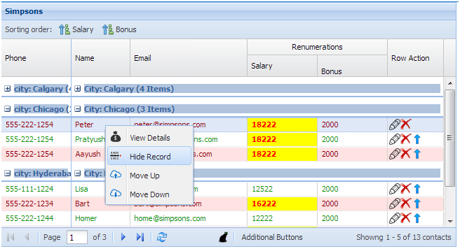
Depending on your need you can have context menu at cell level (by using cellcontextmenu event) as well as at the row level (by using itemcontextmenu event). Further, if you want to have a context menu at the grid panel itself (i.e. not on cell or rows of the grid) then ExtJS provides you an event called “containercontextmenu“.
Links to Popular Extensions / Plug-ins
- Copy and Paste from excel to grid and grid to excel
- Sparklines
- File uploader using browse button and drag and drop on grid
- Grid Group Button With Badge Text
Summary
In this article I have tried to cover the visuals that you can achieve using grid panel. While there are exhaustive set of off-the-shelf functionalities, there are others which you can achieve through the use of plug-ins. Further, like any component, grid panel is also extendible and you can add your own desired functionality. Focus of this article remains on showing possible visuals and this article will keep improving as and when I will come across something interesting to be shared.
I hope this article gave you a reasonable glimpse into what to expect from Grid. Again, I will emphasize that, whatever I have covered is just a subset of what ExtJS provides and you must refer to relevant API document to get the complete list of features / capabilities.
Reference
- http://docs.sencha.com/extjs/4.2.0/#!/api/Ext.grid.Panel
- http://docs.sencha.com/extjs/4.2.0/#!/example/build/KitchenSink/ext-theme-neptune/#array-grid
- http://docs.sencha.com/extjs/4.2.0/#!/guide/grid
- http://docs.sencha.com/extjs/4.2.0/#!/example/build/KitchenSink/ext-theme-neptune/#grouped-header-grid
- http://www.mysamplecode.com/2012/04/extjs-grid-grouping-summary-example.html
- http://docs.sencha.com/extjs/4.2.0/#!/example/build/KitchenSink/ext-theme-neptune/#sliding-pager
- http://blog.dgaspar.com/sparkline/
- http://www.sencha.com/blog/first-look-at-ext-js-4-2-grid/
Very useful information you have shared. Thank you for the updates.
ReplyDeleteJava Online Classes
Azure online Training
Great blog. Thanks for sharing such a useful information. Share more.
ReplyDeleteJira Training Online
Jira Course Online
Uthritingraph_peAurora Alejandro Cox https://wakelet.com/wake/cIs04uGsAs-1Z_aDiat3U
ReplyDeleteinfelrabor
sconbilasde_Manchester Carol Collins
ReplyDeleteDownload
tadartestda
Your sharing of this knowledge is very helpful. I appreciate the updates.
ReplyDeleteCEC Best Colleges In Hyderabad
pleasant day! I just wanted to give this website a big thumbs up for the amazing material it has. I will check around more when I return to your website.B.Com Computers Colleges In Hyderabad
ReplyDeletenice day! I just wanted to give you a big thumbs up for the amazing content you have on your website. I'll come back to your website soon to have a closer look.CMA Coaching in Hyderabad
ReplyDelete